It’s like the same but with a background color that has rounded corners.
That’s always the case.
I mean, they could stop messing with things that aren’t broken for once…
Eh, it’s a fine line tbh. Not that I enjoy defending Google.
You get both “this UI hasn’t changed in a decade” and “this UI is perfect never change it” in relatively equal amounts. The rest honestly don’t care either way.
Imagine if they actually brought back “options” and let you choose between changes rather than force them on you.
That would turn into spaghetti code and unmaintainable tech debt really fast. Now every time you make a change you have to make sure it doesn’t break previous stylesheets, or you need to run different versions of the same codebase for each stylesheet that will need updating for security vulnerabilities and stakeholder whims.
Not really. At least if you plan to have it customizable in the first place.
Then it becomes harder to change when you want to add in new features still. There needs to be a fine balance between giving options and having a clean single-option code, and offering 2 different video players is not it (it sounds like some shortcuts got broken so it’s not just a CSS that got applied)
You are right. I forgot we were talking about a web front end, and I was think of an application. I take it back.
I am just so used to watching you tube with applications on desktop and mobile I forgot we were talking about you tubes new web front end.
Because the seek bar overlaps the video as it is playing, and because the drag button is huge whenever you mouseover it, it is much harder to locate chapter marker visually.
Change for the sake of change is not good.
I’m sure someone will release an addon or some custom CSS to fix it.
Which shouldn’t be needed
It’s already needed for the current UI. ImproveYoutube is a godsend.
It looks exactly the same just a little different skin
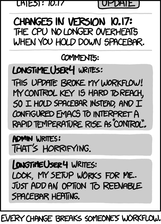
In their defense, I’m not sure I have ever seen a major UI redesign of some piece of software that the users of that software actually liked, at least at first. Inertia and muscle memory are powerful things.
exactly one comes to mind: blender
How is that in their defense?? You reveal them for the gross imcompetents that, and almost all developpers are.
If foreign strangers impose changes on my motor cortex then my prescription is to give them flamethrower enemas.
Stop it, just stop it! Or else!
LOL, nailed it.

I’m still bitter about browsers removing backspace for previous page. How was that hard to maintain?!
https://support.mozilla.org/en-US/questions/1336330
Is there a way to restore backspace button function in the newest version of Firefox, so when pressing it the previous page opened?
This function was very helpful for me!
To prevent user data loss when filling out forms, we’ve disabled the Backspace key as a navigation shortcut for the back navigation button. To re-enable the Backspace keyboard shortcut, you can change the about:config preference browser.backspace_action to 0. You can also use the recommended Alt + Left arrow (Command + Left arrow on Mac) shortcut instead.
NICE! Now I’ve lost my muscle memory for that key, but I’m back (heh) baby!
The better UX could have been making this a regular option, and (by default) showing a warning dialogue if using backspace to navigate would clear out a form.
Haven’t done much web UI, but I’m guessing that are too many way to skin the “form” cat to account for.
In any case, first time I’ve read any reasoning on removing it. Chrome killed it long ago and I was using an extension to re-enable it. Probably could have done as I just did in Firefox, fiddle with the config.
I understand the reasoning, but I really wish Firefox had configurable keyboard shortcuts.
heck, everything should have configurable shortcuts. It’s an accessibility feature with an obvious curb cut effect.
Please add your voice to these discussions
https://connect.mozilla.org/t5/discussions/hotkeys-yes-please/m-p/86441/
https://connect.mozilla.org/t5/ideas/customizable-hotkeys/idc-p/85695/
How very luddite of you
luddites were not anti progress, they were pro workers rights. today’s usage of the word is insulting to their work.
Hence the reason why you make small gradual improvements over a long time. YT has been around a long time, and Google should know better.
Well the old Google development company would know better, the new Google advertising agency doesn’t give a shit
People hate two things the most: things changing and things staying the same.
It look sexy.
I think so too, and we are entitled to our opinion.
The adverts on youtube have become so unbearable so no amount of UI change will convince me to use it as intended. If there’s a long video I want to watch, I download the video first and watch it using VLC
Chrome user? No ad blocker?
My ad blocker stops all the ads except for the sponsorships that are in the video… Y’all watching YouTube without blockers?
It’s more difficult to block ads if you’re casting to a television so downloading is better for my use case
No it’s not; install an APK of SmartTube beta
Use smart tube for TV
Sponsorblock usually helps with that.
Just like they used to combat rw disinformation
What a great day to be a grayjay user lol
the new design looks like it came from ten years ago
Looks like they just adopted material you design. It’s a ‘whatever’ change for me.
The heck is this title?
YouTube says goodbye to decade-old video player UI, but users hate the new design
Meanwhile, the article itself just cites a few tiny aesthetic changes and like four random Reddit comments. Doesn’t seem like they even tried it themself… That’s justifications for 460 upvotes?
ugh, this is so much worse. takes up more space, is more distracting.
I want to be able to skip around in videos and not have the screen covered by ugly pill buttons
At least it’s not covered by a dark shade now. 👍 I’m initially for this change. Good to see an iteration. Let’s see how it goes.
At least it’s not covered by a dark shade now.
Why does that matter? It looked fine.
It was literally my favorite design of online video player, and I remember enabling it back in the day when it was still an experimental feature.
Yeah. It also looks like the buttons might light up on hover, but they already basically do that so that’s only a very small plus. I too remember being annoyed about not seeing content behind the shade properly.
I’m not defending google here, but I’m sure a decent chunk of the complaints are just bitching because “change bad!”
I haven’t seen the change yet and I’m sure there are legitimate complaints as well, but us online folk tend to detest even the smallest changes and go a bit overboard in our complaining sometimes.
The only legitimate complaint I have is I use a 4k monitor at 150% scaling. YouTube, in its design genius, decided that it should show me three videos per row, at like half the screen.
Thankfully with Google I was able to find something that helps
Honestly thank you for posting that link. I thought i had gone crazy thinking that i had only now just noticed the shit UX of 3 videos per row
The article has pics if you want a preview
It looks quite nice actually

Looks like UI from like 2005 lol.
As long as I can still use the J/K/L keys to play/pause and scrub, I see no issues here. People bitching just to bitch.
That said, I do not enjoy the new “everything is bigger” view on YouTube’s home page that was clearly designed for mobile. But that can be fixed easily, so it’s a non-issue.
Seems fine.
Looks fine, bahaves poorly
bahaves poorly
How?
What’s wrong with it?
Thanks, but it won’t really affect me. I only use
Freetubewhen I want to access YoutubeI use Freetube, but it’s currently not playing any videos for me.
Always use the up-to-date version.
Whenever there’s consistent playback issues there’s usually an update on the horizon. Just have to be patient.
ETA: I’m watching videos on
Freetuberight now. It’s working just fine.I have 3 PCs running endeavouros, the other 2 updated freetube fine, but my main one has issues, even after uninstalling/reinstalling/updating to beta. I can open videos externally with mpv, but nothing will play on freetube itself.
“you can no longer hover on the volume slider and scroll or even use the up/down keys to adjust the audio”
That, for sure, is one of the most garbage changes imaginable.
Someone conciously had to go out of their way to remove functionality there.
Maybe there’s a reason for it, but I still think it’s a shit change.
Speaking as a software dev, that’s probably not the case. They probably started completely from scratch and so the inclusion of features depends on reimplementing them on the new platform. It could be as simple as not being ready yet or maybe stats show them that so few people use the feature that they don’t find it worth reimplementing it.
I’m not a software dev, but that’s what I was thinking when I said maybe there’s a reason for it. I still feel like it’s a shit change, but that’s because I use the function.
You could do that before?
This ain’t a problem with PipePipe
yay browser plugins


